LOCATION
San Francisco
CREDITS
Photography: Sharon Risedorph
Timbuk 2
Raw and edgy design reflects brand voice.
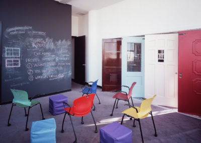
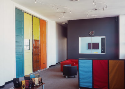
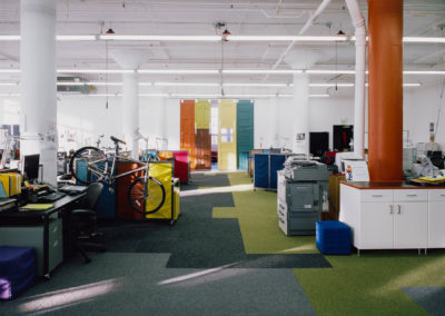
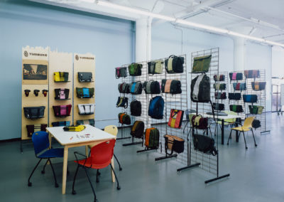
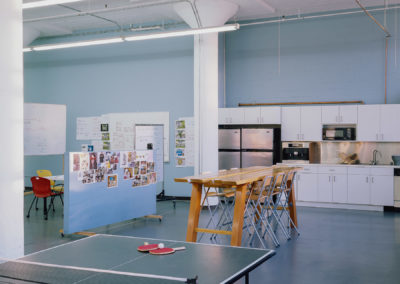
This interior matches the experimental, edgy feel of this progressive Mission-based bike bag company. The design is based on non-hierarchical space, with custom rolling workstations that double as bike stands. The office is designed to encourage interaction and individual expression allowing organic growth through clustering of different user groups. The use of fabric partitions that are constructed in-house, mimic the three-stripe logo that is distinct to Timbuk2 bags. Recycled doors painted wild colors evoke the Mission location, while a random carpet tile pattern denotes work groups that can be changed as the groups expands or contracts. Done on a shoestring budget, the interior is a work in progress, allowing for minimal investment for maximal growth.
