LOCATION
Berkeley
CREDITS
Photography: Sharon Risedorph
RECOGNITION
7×7
Retail Design Blog
Racked SF
SanFrancisoArchitects.org | Best Retail Architect, San Francisco
SanFranciscoArchitects.org | Best Commerical Architect, San Mateo
Convert Man
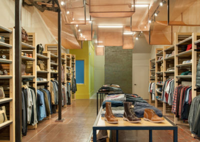
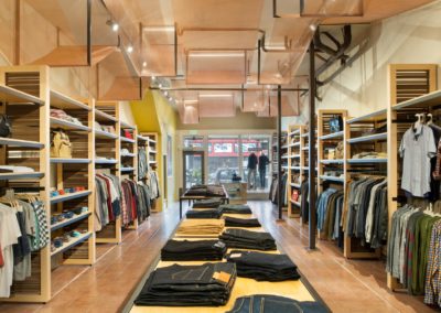
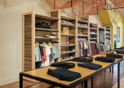
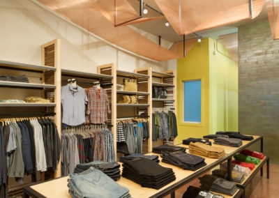
Simple material palette conveys the brand’s ruggedly refined sensibility.
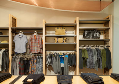
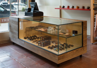
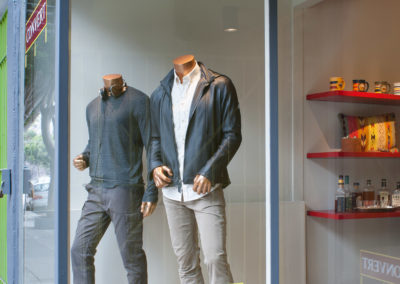
The space reflects Convert brand’s eco-focus to appeal to its discriminating hipster-male clients, with a refined and ruggedly modern sensibility. To reinforce the brand, we maximized use of existing finishes and structure within the 1,100 square foot space. This included removing a dropped ceiling to gain a dramatic 12 foot gallery-like space, restoring the battered tile floors, and bringing in locally-sourced Heath tile to create a handcrafted backdrop that enhances the locally sourced merchandise. Adding a sense of refined roughness is a custom-made cash-wrap clad in distressed burned Cyprus. Angled planes of copper mesh add a dynamic energy, turning a tangle of existing copper pipes into a sculptural showpiece. All of the men’s apparel, accessories, and footwear come from sustainable, charitable, or US-made brands such as Pendleton, Ben Sherman, Freenote and Citizens of Humanity. It was essential that the simple palette was inviting, but did not overshadow the clothing while echoing the Convert brand.
